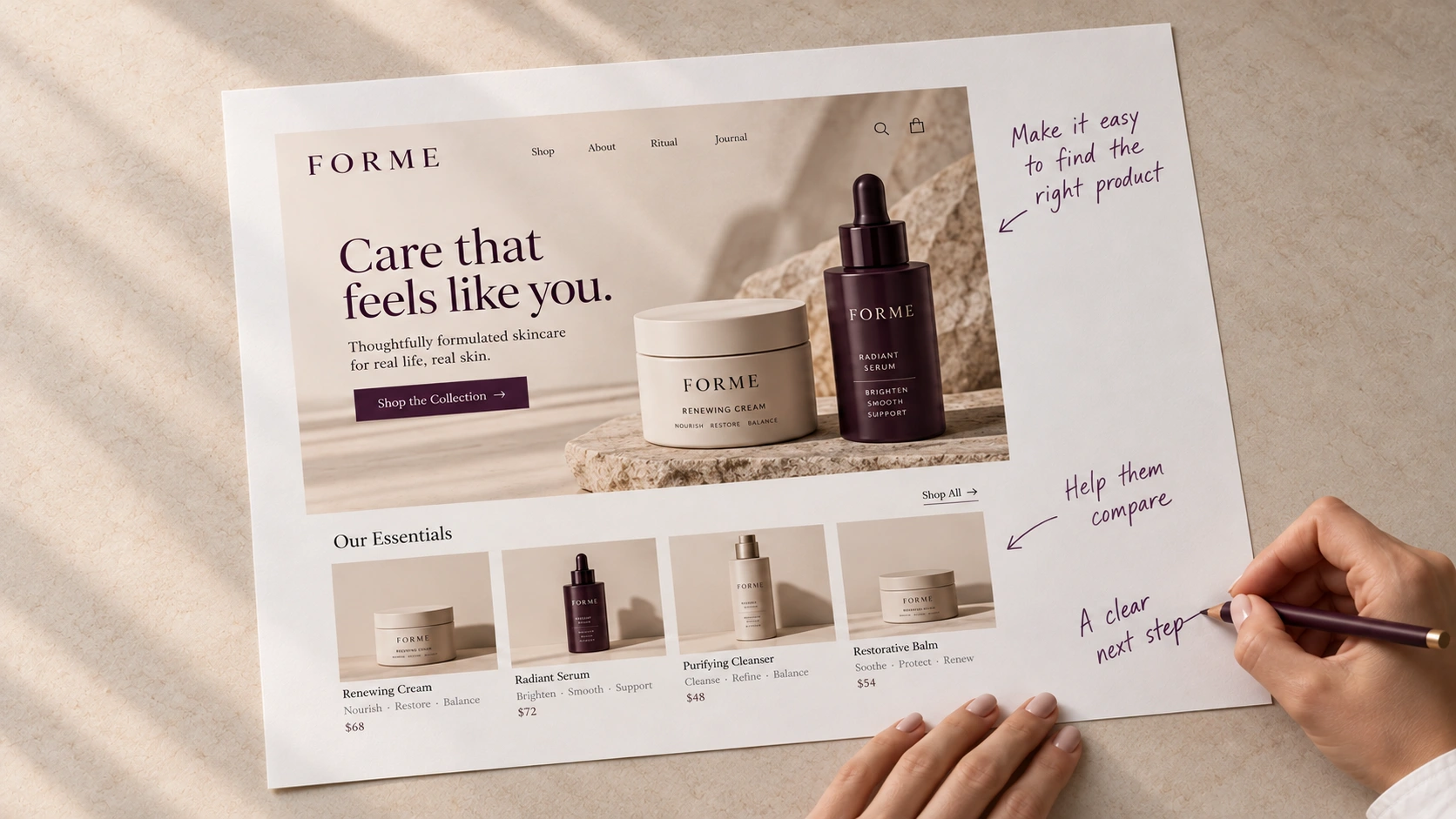
A website can look polished and still leave people unsure what to do next. Before choosing a new layout, it helps to understand what someone needs from the experience.
They may be comparing options, checking whether you understand their situation, or simply trying to find a price. Your website needs to support those decisions as well as express your brand.
Start With the Visit, Not the Page
Think about the person arriving. Where have they come from? What do they already know? What question would they like answered first?
Someone following a recommendation may want reassurance. Someone arriving from an advertisement may need a clearer explanation of the offer. Those starting points can call for different content and paths.
Look for the Moments of Hesitation
Read recent enquiries, listen to the questions your team answers repeatedly, and ask customers to walk you through how they found and chose you. If you have website analytics, use them to identify places worth investigating. A page exit is a clue, not an explanation on its own.
Look for specific friction: unfamiliar product names, unclear differences between services, important information buried several clicks away, or a booking process that asks too much too soon.
Give Each Page a Clear Job
Decide what a visitor should understand and what a useful next step would be. That may be comparing products, viewing availability, reading about your process, or making an enquiry.
Use familiar language, place essential information where people need it, and make the next step easy to recognize. A visitor should not have to learn your internal vocabulary to find the right option.
Test the Direction Before Building Everything
Show a draft to a few people who resemble your intended customers. Ask them to complete a realistic task without guidance. Watch where they pause and what they expect to happen.
Those observations give your redesign a clearer brief: who it needs to help, which decisions it should support, and what needs to become easier.
← Explore More Insights